We are thinking about changing the navigation on the website.
Current navigation on the left side of the website can distract the user. There are 14 categories now. We are thinking of limiting the number to 7-9 categories.
Moreover, we know that displaying only icons is not understood by all users (e.g. older ones). Displaying labels will be more useful to them.
Maybe categories on the top menu will be better solution?
There are few options prepared by us:
Option 1:
Categories menu will be displayed below the main (white) menu. While scrolling down it will disappear, and while scrolling up it will appear once again.
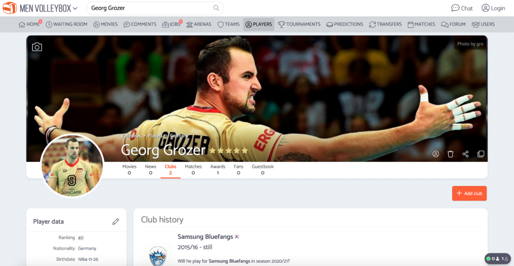
Option 2:
Same navigation but without icons.

Option 3:
Categories will be added to the top menu. On the narrow screen (on desktop devices) hamburger icon will appear on the top-left corner.
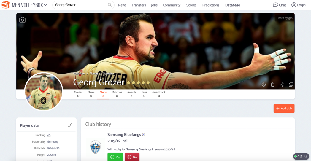
Option 4:
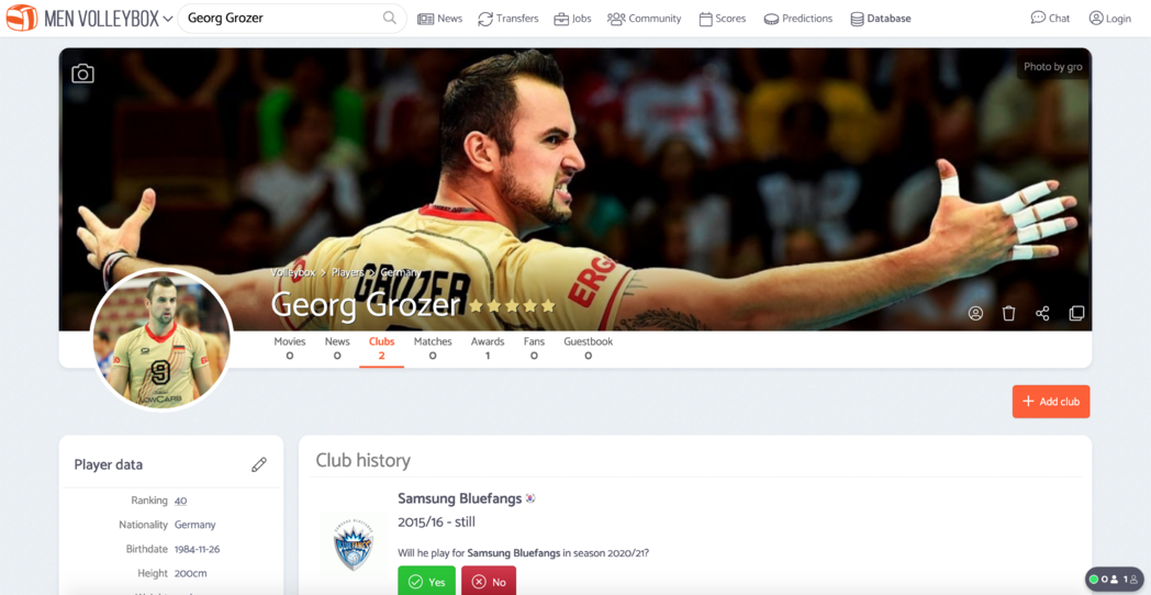
Option 5:
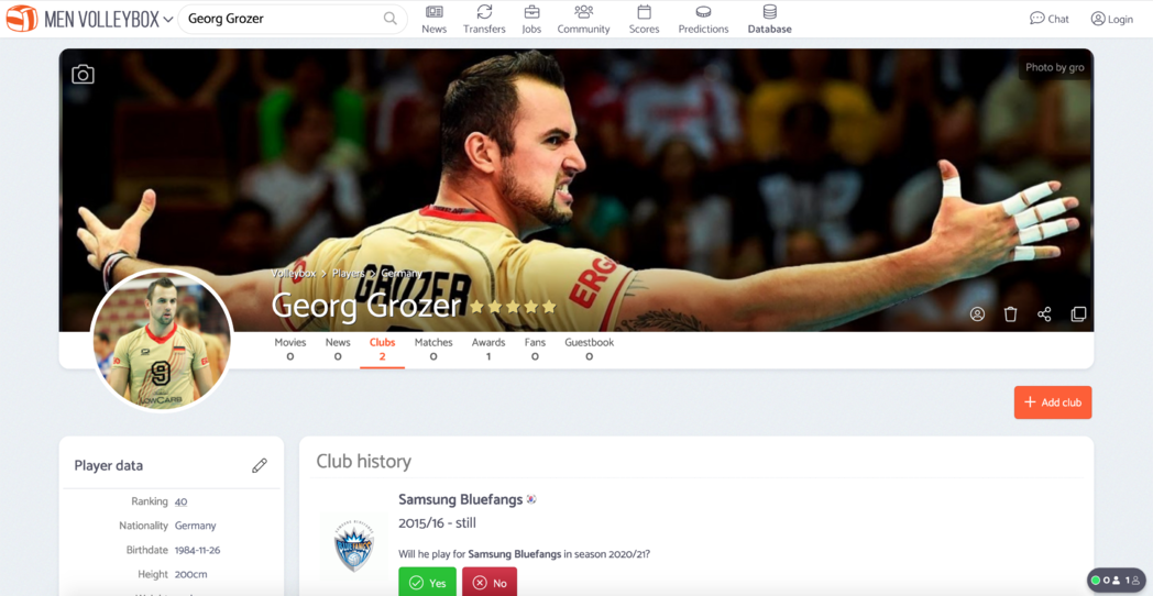
After hovering main categories box with sub categories will be displayed:
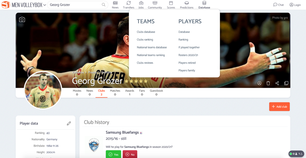
Thanks to removing left menu we will be able to pin the profile wallpapers to the edge of the browser, as presented on the screen below:

There will be only 7 main categories. There will be following structure of the navigation:
- News
- Waiting room
- News
- All movies and news
- Actions movies
- Fans movies
- Highlights movies
- Matches movies
- Me playing volleyball movies
- Other movies
- Players movies
- TOP20 movies of March
- Transfers
- Jobs
- Free volleyball players
- Free staff members
- Job offers
- Community
- Users
- Agents
- Scouts
- Coaches
- Users ranking
- Users activity
- Users achievements
- Fans on matches
- Users from countries
- Users comments
- Forum
- Scores
- Predictions
- Database
- Arenas
- Players
- Players database
- Players ranking
- If played together?
- Rosters 2020/21
- Players retired
- Players family
- Teams
- Clubs database
- Clubs ranking
- National teams database
- National teams ranking
- Clubs reviews
- Tournaments
What is your opinion regarding this topic? Website usability of the site for everyone is key for us.

 Férfi Röplabda
 Strandröplabda


I really like the first option.
@sitenoise @VitaliiLatysh what do you think about it?
@Volleybox Option 4 looks more consistently and organic with others header items: chat and login.
@Volleybox Not sure about sub-navigation. It looks pretty massive and verbose - the first feeling. Seems some of them can be just filtered on the base page. Players, for example.
The point is not overwhelmed the header menu with sub navigation but move it to the specific page.
Even though that wallpaper of Georg Grozer is about as cool as a wallpaper can be, there's something about the Michal Kubiak one that offers so much more :)
I love the gist of this. A column of 14 abstract icons is hard to swallow, but a row of words, no matter how many, is easily digested --regardless of what the experts say.
Visually:
[I like] Option #3. Icons are a waste of space and add nothing (Logged in icons, the right end clump, like Chat and Notifications are ok).
Hard vote against options 1&2 with the double row banner. And a hard vote against a top banner that comes and goes when you scroll up and down on a page. I find that distracting and annoying, but it's trendy.
I would like to see what Option 3 looks like with the background of the top banner remaining light gray like the rest of the page, but that would be moot if you do the "pin the wallpaper" thing.
Explorably:
Where will the "News" submenu navigation sub-menu button take us to? Are you thinking of splitting off "News" posts from "Movies" posts?
I'm not sure there's enough "News" here (speaking of women's side only) to be a category of its own but I would love to see a page (or whatever) dedicated to News posts people make (without all the fan movies and such) but I don't think there are very many news posts being posted. If you keep them intermingled I'd like to see them visually distinct from movie posts.
Maybe consider separate 'Top Level' categories of "Media" and "News"? Where "News" would have News posts, user comments, (chats?), and the Forum, while "Media" would have all the movie categories. Ditch "Waiting Room" in favor of "Latest".
"Scores" is the new "Matches"? Hmmm ... what about matches that aren't scored yet?
Userly:
People who land here from a google search while butt-stalking Saori Kimura versus active users here doing work and hoping or attempting to interact with other active users. I can hardly wrap my head around how different those two users are--and how you might structure the site to accommodate their different needs, goals.
For example: I saw the notification I had been @'d in a "topic"(?) 'new design of navigation'. I decided to see if I could find it instead of clicking on the notification link. I couldn't. But I did notice a few posts by @VitaliiLatysh that I missed because they had no comments (new user comments get flagged on the left hand side bar).
I'd ditch the Forum altogether except for a "Help" section, essentially the Volleybox.net section. It's not a good look for the butt-stalkers and other google searchers who land here to check out a forum where the latest post is 4 years ago. But I digress ... :)
In term of design/navigation, 7 categories is a phone number; 10 categories is a phone number with area code (in the US). It's not that hard, or overwhelming (don't bury 'tournaments'):
(Search) - [[DATABASE^]] - [News^] - [Media^] - [[Tournaments]-[Scores]-[Predictions]-[Transfers]] - [Community^] - [Jobs^] ...
... ("^" is the VITAL disclosure triangle, and I would slightly alter the background color of the leads with no disclosures (and DATABASE)--the ones I have in double brackets)
In terms of the VITAL red flags for new items, will they be at the top level of categories, or on their sub-menus? I think you need them on both: Top menu to notify and sub-menu to zero in.
BTW - what's up with the "Rosters 2020/21" thing? Is that new? How do we fill it out? What will it look like filled out? What's the purpose behind it?
@sitenoise so option 3 is the best for you?
This page will contain news and external links only (without movies).
It's just new name for "Matches" category. It will works the same as now.
What can I do with that? Should I create fake posts in forum threads?
I'm not sure about Media and Tournaments sections there. Tournaments will be inside the Database. Moreover I can list current and soonest tournaments in the Matches (Scores) category. I was thinking about displaying "Forum" category instead of that.
Yes, for both of them.
It is nothing new (created few years ago). This page lists players which current club should be checked by users. Just look on men volleybox: https://volleybox.net/players/current_rosters . I will check why this page is empty in women volleybox.
@Volleybox Yes I like Option 3. I edited in an "[I like]" after the fact because it wasn't clear. But I think "pin the wallpaper" is even better. Would like to see that with a dark theme across top.
Options 1&2 are good for not burying as many things in submenus but the double row seems to call too much attention and take away space from beautiful wallpapers.
My suggestions for the top categories is based on what *I* want :) You have much better idea of what most users do here
That Rosters page is cool. It would solve my request for "batch" processing rosters.
How do I "Like" a post? LOL I can't figure it out :(
[Edit] I mean an original post, not a reply.
@sitenoise The "like" seems not to be working, but it actually does ! Refresh the page after liking a post, and you'll see ;)
@Sherlock thanks!
@sitenoise it works fine now. Thanks for reporting a bug.
@Volleybox Could you please share the same screenshots for mobile?
@VitaliiLatysh it will look the same as for now
What about that?