


Let the video frame be bigger - for the whole width. There is no need to have so much empty space.
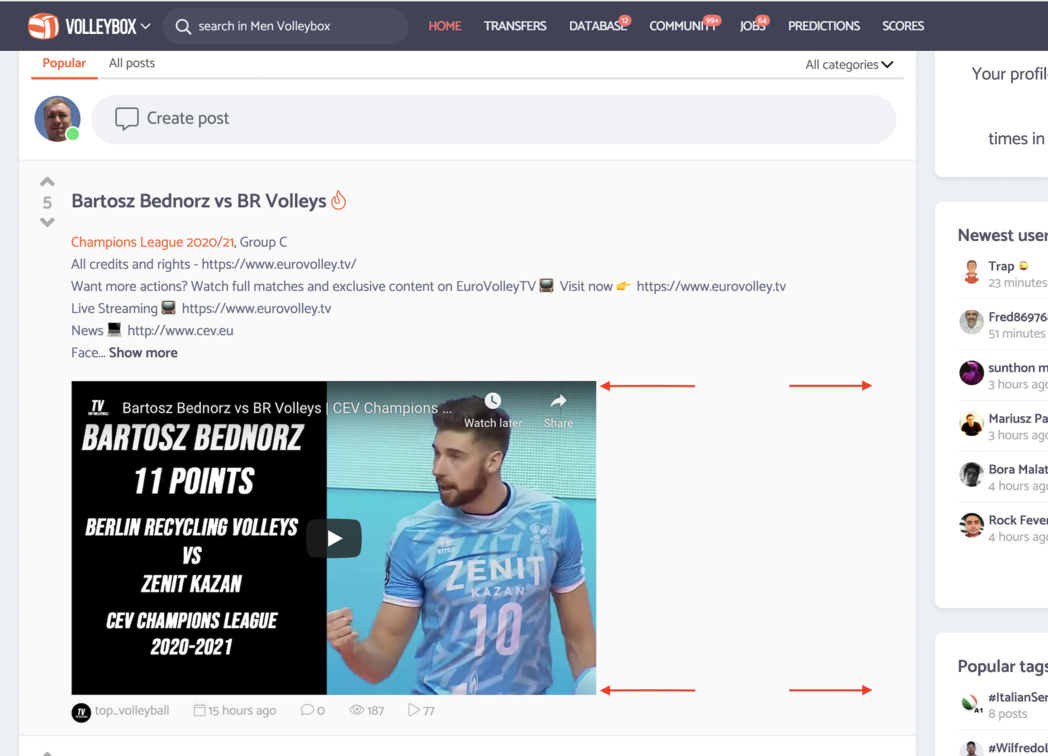
Let the video frame be bigger - for the whole width. There is no need to have so much empty space.
 Qui est la meilleure joueuse de volley-ball de tous les temps ?Afficher le classement des joueurs
It is a little bit bigger now.
The idea was to present whole box on the screen (without need to scrolling it).
@Volleybox if the description is put under the video, the video frame can be extended for the whole width.
Anyway, who read this description if there is a video!, doesn’t it?
@VitaliiLatysh descriptions added for most of the videos last time doesn't have any value. In most cases there are just advertising links to websites and probably most of users are just skipping the descriptions. It doesn't change the fact that I would like to read interesting descriptions.
@sitenoise @Sherlock @HappyWithVolleyball @Dorien @breakingice @JP @jais what do you think about idea of hiding descriptions and making video player full width? Personally I'm not sure about it.
It will looks like that:
@Volleybox I don't see how eliminating descriptions “widens” the video:
Well, that's not a problem for me as I don't read 95 % of the descriptions. Most of them are not about volleyball but about advertising for the channel which published the video. It looks a bit less aesthetic though.
When I posted that screenshot in the above message, I can't find a way to get the cursor below the image to continue typing something. Am I missing it? All I can do is type a caption. I can't get the cursor below the image
@Volleybox I think it “looks” better in a screenshot without the descriptions, but you know how I am about UI that looks better in a screenshot :)
Frankly, I'd almost vote for showing only the descriptions and hiding the video. I want to know why the person posted the video, why they think I might want to watch it.
As @Sherlock and @sitenoise already said, I would hide the description too. We can often deduce from the title and "photo" what the video will be about. Nowadays every description is about the YouTube channel and not about the content of the video.
@Volleybox , I think that hiding the description makes it look like a spam of videos on the feed. I'm a fan of the descriptions when they dont really function as a description (since most of the info is already presented in the video title), but more like a publishers comment or so. But either way, I think this display is good and that it should be kept.
@Volleybox still not filling the whole width.
@VitaliiLatysh I believe there is a resolution sweet spot, like 1280. You can see in the screenshot I posted above (unless I'm completely missing it) that the video takes up the full width — at ~1280xXXX. My screen is 1440 and looks like your screen shot. I don't know anything about the programming of dealing with that.
I notice a similar issue with wallpapers. The stretching stops and white space takes over. What is the resolution of your device?
@sitenoise 2880 × 1800
I have the same opinion as some of the others - I would hide the description, because it's just YT channels. I like the idea that on the homepage there would be just a title and a video. And if you clicked on the video then you would be able to see the description too.
Or: Maybe there could be an option of a subtitle which would be displayed on the homepage, like the essential info about a video (who, where, when, against who etc.). However, this could just complicate the whole thing, which would not be a good idea…
Speaking of width, I would propose to keep it as it is, because it looks more aesthetic if we have some blank space. It's better than to have everything filled up with stuff. It makes the page more transparent and easier to get through it in my opinion.
Thank you @sitenoise @Dorien @jais @Sherlock @JP for sharing your opinion.
As a result hashtags are presented in the place of descriptions. They can say more than advertising links. Moreover we have an international audience and some part of them are not English speakers so hashtags presenting players, teams and tournaments names will be more understandable to them.
Regarding width, full width player (1013px) will make scrolling the website more difficult. I tested it. I would keep the width as it is now.
Thank you all for your part! Will close the subject.