


About me
Fan data
Social profiles
Comments
@Volleybox yeah, they'll probably change it to something else next year anyway. This thing is like an extended all star game. We don't have a solution for that
Have I mentioned I would like to see a separate tab for “facts”, "sources" or “basic info” (or something like that) where the posts are not overwhelmed and lost in a flurry of youtube videos and Instagram retweets?
@Volleybox A cosmetic thing: after adding a match report, the spot where the report icon is at shows “[object Object] 1 ”. A refresh of the page replaces that with the report icon.
I never know if these things are just for me and my extension laden browser or not
@PierreFoucault I believe it would be more useful to the volleyball community at large to have documentation about the tournament rather than it would be to figure out a way to fit it into the “ranking” system of this site. It doesn't make sense to give points for this thing, except maybe stat points like ‘best scorer’, ‘best spiker’.
It's been kinda fun watching some of it, especially the drama of the drafts. Someone suggested they could kick it into a ratings bonanza if they actually voted someone OUT each week … Survivor Style! ?
Did you hear the “some mom from Brazil” comment re: Sheilla LOL
I have no idea. As to the ultimate ‘winner(s)’ … a “News item”?
The interesting thing for me about this funny tournament is the drafts and how the teams are made. Do you think there is a way to document that? I think in the beginning I suggested making each week it's own tournament, or round, or something, but that's a mess.
We really need a way to “pin” certain posts in the Timeline. Or have a separated “facts” tab of some kind so critical info isn't lost in a maze of fanfare. That's the only suggestion I can come up with.
If a person doesn't know anything about this thing, the profile page here doesn't help in understanding its uniqueness.
I was hoping wikipedia would have something, at least documenting the teams, but nada. There may be a page in the works but it can take months to get a Wiki page published.
Sorry I'm no help. What is your idea?
@Volleybox said: “you suggest duplicating a data contained in the match reports”.
Well, the score is duplicated from the match report. I wouldn't want to see empty boxes everywhere, but given that match reports are often in a language many people don't speak, or a format that folks aren't used to, I thought it would be nice if there was a way to ‘highlight’ a particularly good performance. If everyone hits 10/30 who cares? But if a match has someone hit 29/40 I thought it would be nice to highlight that.
I have no idea how you'd implement it without “duplicating a data” of boxes. I wouldn't want that. Perhaps just a small text field next to each player for “notes”? Could be “29/40 @72%” or “got carried off in a stretcher Set 2”. Well … maybe not. People could get verbosely carried away
As for: “I haven't found any other website that displays the arena in the match list” ….

And they're clickable!
Thanks for aligning the match additions. I wish it still said “Report” but vague icons are better than dancing around.
@PierreFoucault said: “Would it be possible to make it clickable ?”
Please. I second this request!
@Volleybox can you do something to make the additions to Matches be in the same place? Like center-align “Reports” in the middle right under the score, and "Movies" aligned left, and this “MVP” gamed up nonsense aligned right?
I scan the lists to make sure there are Reports for all the matches and it's frustrating when “Reports” is dancing all over the place, as in:
Reports
Movies → Reports
Movies → MVP → Reports
MVP → Reports
hold on … this MVP thing is volleybox user vote? Not who actually won it? Someone just voted a player who wasn't even rostered for this match: https://women.volleybox.net/okayama-seagulls-toyota-auto-body-queenseis-c40499 ??
[Edit] Bad vote has been removed and all the MVP buttons as well, except for the one for the player who did get a bouquet of flowers. Not sure why it's labeled a “vote”?
Hey, if we're going to go there with this show more thing, might be cool to have:
| hits / | pts / | % / | blocks / | aces |
for each player. I'd only fill out any newsworthy boxes but it would be cool
Oh my gosh, yes! Please show the Arena without having to dig under rocks for it.
Wait. I see that there is a hide-and-seek alternative. Still a bummer, imo, as the target is small and useless for keyboard wizards.
I'd also like a “close” button rather than having to use the browser back button but that's just me.
Do the players get points for being the MVP?
@Volleybox This is just a cosmetic thing. When I use a permalink for a club's transfers, for example:
https://women.volleybox.net/transfers/2021-22/ALL/1/1/clubs?search=JT
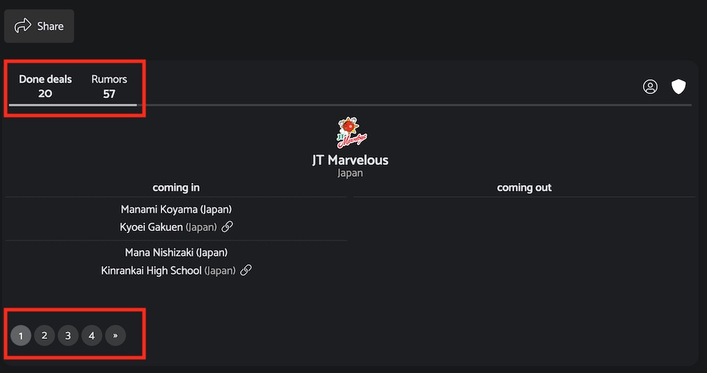
It has that inaccurate(?) info outlined in Red, above.
If I click on “Page 2”, it goes here:
https://women.volleybox.net/transfers/2021-22/ALL/2?search=JT/1/clubs?search=JT
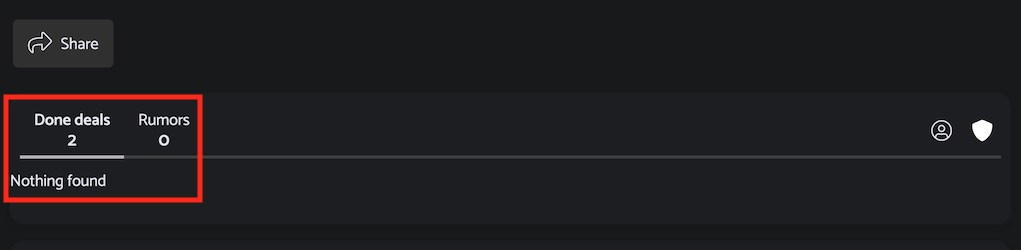
If I then click on the “Done deals”, if goes here:
https://women.volleybox.net/transfers/2021-22/ALL/1/1/clubs?search=JT
… which is the same URL of where I started but it's accurate in terms of deals and pages:
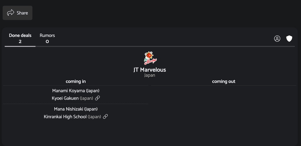
… which is what I expect it to be.
There's probably only so much you can pack into an URL, and it's not terribly bothersome. I can see the information I need.
I like that the add/cancel buttons are see through a lot! but it took me a moment to see them when adding a profile photo (when it's smaller than this it's harder. They seem very visible in this 2X screencap:

@PierreFoucault seems mine is a little more contrasted (Mac w/Waterfox browser):
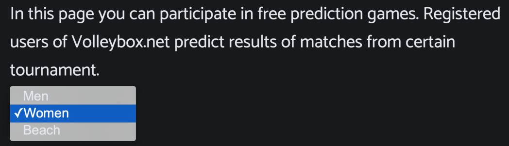
@PierreFoucault hmm I don't play the prediction games so I didn't see that. I went around and checked most of what I use here and didn't find any anomalies.
Thing I like the most is the profile pictures just POP!
What are these two things?
2020-02-16
Asking for a recommendations
2020-02-14
Newsfeed personalisation
@breakingice I think this feature got back burnered
@Volleybox ?
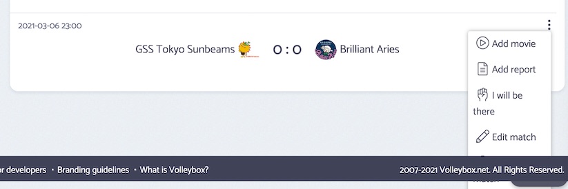
I re-dated a bunch of the “postponed” matches to the latest date of the Japan V.League Division 2 2020/21 tournament to 2021.03.06 (both from Round 2 & 3). They have now been officially cancelled. But I'm unable to delete them:

[Update] It turns out the matches are deleted, but that error message came up every time
[Update 2] It was a little tricky deleting the last one as the footer overlaps where the “Delete Match” is:
@Volleybox I figured #7 and #3 had a logic I didn't grasp right away. And I see how #2 works now. I'm making use of the Tournament search and also see how it includes imports I was fearful of losing.
#1. Hiding content from a user with no indication there is hidden content is odd UI/UX. That's what scrollbars are for. Indication. They aren't there to be “grabbed” and shoved sideways or up and down. I know people do that though, even while so-called ‘designers’ <cough>Apple</cough> continue to make them so small you can barely grab them.
With vertical content you can use the up/down arrows, the space bar, or a mouse's scroll wheel. What are the options for moving horizontally? Grabbing the scroll bar? I'm a mouse guy and didn't know there was extra content there after visiting the page many times over the course of a couple weeks. What about users who are primarily keyboard wizards? They'll never see it, and if they do divine there is hidden content they are forced to grab their mouse.
Could you put arrows on both ends that would indicate there is content beyond the visible and make getting to that content easier and more enjoyable. I assume keyboard wizards use the tab key to get to them and then arrow keys to actually scroll.
@PierreFoucault It's like their National Olympics, a multi-sport event every four years. Word on the street for volleyballers is that it is THEE tournament to raise the fan juices and player pride. I think it also impacts a lot of players' future salaries and advancements.
Thanks for solving that problem.
Another thing about some tournaments that's probably minor in the grand scheme of things is that “Club” tournaments get tagged as “seasonal” like 202½2 (← LOL). I suppose it's okay because the rosters are in line with that, but it's not really a fall to spring thing.